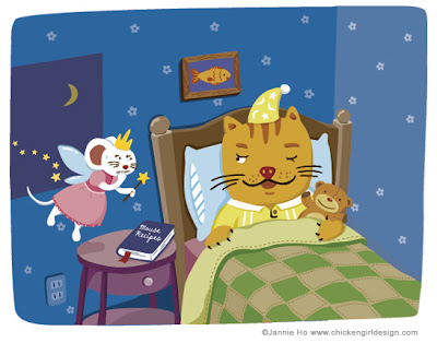
Before
 This illustration is ok- cute enough, but nothing too special. I was lucky in that I had (and still have) an awesome agent to help me improve on this piece. The cat needs to look more like a cat and the mouse needed to look more like a mouse (even if they are drawn in my style). The most important thing of all is that an illustration tells a story. What story was this image telling? Is it loud and clear?
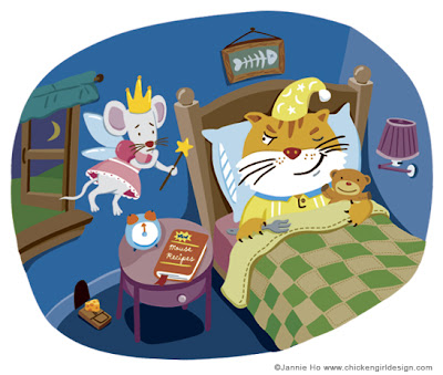
After
 The new and improved version. Besides the new details in the room (curtain, lampshade, etc.) There is more of an element in story telling; the cat is now holding a fork, there is a mouse trap with cheese. The cat is definitely on the hunt for mice.
I've learned a great deal with this piece and try to bring the same attention to details to all my illustrations. Hopefully this helped you too!

20 comments:
Wow, thanks for sharing! That is really cool to see, I love how the mouse changed and became cuter but still stayed the same. great changes!
thanks a lot for sharing this valuable experience...i love the new illo...absolutely great!
hope i can improve my style constantly...cos you have done it so well...i admire your work ;)
Yes, I like how there is more detail in the "After" one.
I really like the extra details that you added - makes the whole image more dynamic and fun to look at :)
I enjoyed that! The illustrations (both of them) are charming; the insight into the improvements was helpful. Thanks. :)
Very interesting. This picture of the dead fish behind the cat´s bed is killing me. Very well done.
Nice! I do appreciate all the info you've shared with us. You're right, each illo must tell us a story, I'll try to do that with Godo from now on ;)
Thanks, Jannie!
Love seeing the before and after. Especially since I saw nothing "wrong" with the first.
Really cool to see the changes!
Thanks
Great to see you are back with GREAT illustrations as always. I have been wanting to email you...about tips you can suggest me to make stationary, like notebooks etc? I love them!!!
But, don't know where to have them printed.
Email me, whenever you have the chance. I will email yo anyways. I have to look up for your email. Do you know mine? Thanks girl!
HUGS!!!
Marjorie
I forgot, I LOVE the second version best! ;-)
Hee hee! Too cute, and much improved. Very ambitious of you. Should be a nice addition to your portfolio.
I understand what you meant about the story not being as clear as you'd liked in the first, though I did get it...It just wasn't as obvious. I like both versions. The second one is more detailed and needs less thinking about it! :) Both are great, and I think it's very neat that you shared this info. It helps me out, too! Your work is so inspiring to me, so I appreciate seeing the before and after images. Thanks!!!!
Oh, one thing I really liked in the first one that you left out of the second one was the little trail of stars following the tooth fairy. I liked that little touch :)
This is great to see. I have been trying to add more detail as I develop my illustration method - but at the same time not getting it too busy. I have noticed you also started using textures to add more to your illustrations recently and I think it really is a wonderful addition.
If you don't mind me asking how are you doing that? I am wanting to start adding some texture to some things, but would love to know the best way to do that. Any of your tips/tricks would be appreciated.
Thanks for sharing!
wow, thanks everyone for the comments!
majeak ann-I've just been using my home printer (an epson) and as for professional printers I use www.psprint.com. I actually dont know too many resources! If you find out about other good places let me know!! :-)
Tracy- yes, you are right! I did notice the second one didn't have the trail of stars..I guess I forgot about it and left it out.
Kelly-I've been digging around illustrationclass.com for great tutorials in getting texture in Illustrator. I also got the book Crumble Crackle Burn by Von Glitschka (www.texturebook.com). Thats where my textures have been coming from. Good stuff-do check it out!
As always, I'm inspired by your chickeny-goodness. Love your work! It's so fun and colorful and I'm amazed at your details & textures too. (Still trying to figure out how you do what you do.) Thanks for sharing and inspiring the rest of us.
This is so cool to see. It's amazing what a few little tweaks can do.
Love the fish bone picture!
I love how you've shown the before and after. I really like the changes you've made and the one-eyed cat and mouse trap add the perfect touch!
wow, excellent lesson. thanks, inspiring, and such a great lesson.
We should all do this a little more, not redo necessarily, but looking at our old work. I think the more one 'exercises' creative muscles, the more risks one takes with each new piece. I'm going to dig out some of my old stuff! Nice work!
Post a Comment