 I did some sewing this week (way over due), this little pouch was made from a (slightly modified) pattern from The Crafters Companion. The cute twill tape is from The Small Object, which I bought a few months back at the Renegade Craft fair. This pouch was meant to hold lip gloss and such but since I have way too much stuff, it doesn't really hold enough. I need to make another version with twice the size!
Sunday, September 23, 2007
Mini pouch
Thanks to everyone's comments about my ATCs, I decided to put up the kitty and the crocodile for trade. I wanted to put up the pig card too but it accidently took a dip into my cup of coffee and it got ruined.
 I did some sewing this week (way over due), this little pouch was made from a (slightly modified) pattern from The Crafters Companion. The cute twill tape is from The Small Object, which I bought a few months back at the Renegade Craft fair. This pouch was meant to hold lip gloss and such but since I have way too much stuff, it doesn't really hold enough. I need to make another version with twice the size!
 I did some sewing this week (way over due), this little pouch was made from a (slightly modified) pattern from The Crafters Companion. The cute twill tape is from The Small Object, which I bought a few months back at the Renegade Craft fair. This pouch was meant to hold lip gloss and such but since I have way too much stuff, it doesn't really hold enough. I need to make another version with twice the size!
Wednesday, September 19, 2007
ATCs-First attempt
 These are my first attempt in makeing ATCs (artist trading cards). They are digital prints with a bit of fabric collage and I ran it through the sewing machine with a zig zag border. They look OK as a set but I am not happy with them so I don't think I will trade these off. It was a good experiment though.
I just signed up over at Monday Artday ATC where artists can trade there. There are lots of cards I want yet I have nothing to trade with yet!
Sunday, September 16, 2007
Illustration Friday- wedding
Monday, September 10, 2007
Mona "Monkey" Lisa
 "Monkey Lisa" made with Sculpey.
This piece was commissioned by Nickelodeon magazine for their art-themed issue. They had asked various illustrators to reinterperet the Mona Lisa and this was my piece. Unfortunately I didn't make the cut and mine is not in the issue. :-( But I am glad I can still share it here.
Check out the other interpretations from the magazine here.
Check out the other interpretations from the magazine here.
Saturday, September 08, 2007
Old work vs. New work
Thanks for all the comments for the previous post, everyone! Its great to get positive feedback and I will be sure to do more posts like it in the future.
Over at the illustration for kids blog, we are comparing our old work vs. our recent work. What a trip down memory lane!
 On the left, a self portrait (yes, the chicken obsession was already evident) and on the right, a gouache painting for a concepts class.

Over at the illustration for kids blog, we are comparing our old work vs. our recent work. What a trip down memory lane!
Work from Art school days:
 On the left, a self portrait (yes, the chicken obsession was already evident) and on the right, a gouache painting for a concepts class.
Going digital- work from 2003:

You can read more on these here. And be sure to check out the other Illustration for Kids group members' comparison. Its quite facsinating to see how we've all progressed.
Wednesday, September 05, 2007
Improving on your work
I am always looking for ways to improve my work. Sometimes it only takes a small detail in making an illustration from just OK to being great. Digging around the computer, I found this old piece I did for my portfolio from a few years back.
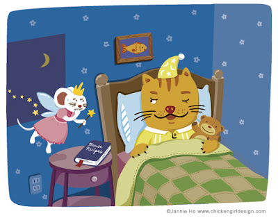 This illustration is ok- cute enough, but nothing too special. I was lucky in that I had (and still have) an awesome agent to help me improve on this piece. The cat needs to look more like a cat and the mouse needed to look more like a mouse (even if they are drawn in my style). The most important thing of all is that an illustration tells a story. What story was this image telling? Is it loud and clear?
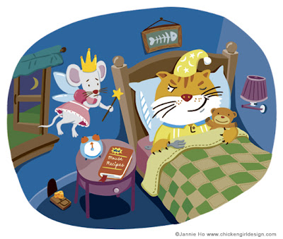 The new and improved version. Besides the new details in the room (curtain, lampshade, etc.) There is more of an element in story telling; the cat is now holding a fork, there is a mouse trap with cheese. The cat is definitely on the hunt for mice.
I've learned a great deal with this piece and try to bring the same attention to details to all my illustrations. Hopefully this helped you too!
Before
 This illustration is ok- cute enough, but nothing too special. I was lucky in that I had (and still have) an awesome agent to help me improve on this piece. The cat needs to look more like a cat and the mouse needed to look more like a mouse (even if they are drawn in my style). The most important thing of all is that an illustration tells a story. What story was this image telling? Is it loud and clear?
After
 The new and improved version. Besides the new details in the room (curtain, lampshade, etc.) There is more of an element in story telling; the cat is now holding a fork, there is a mouse trap with cheese. The cat is definitely on the hunt for mice.
I've learned a great deal with this piece and try to bring the same attention to details to all my illustrations. Hopefully this helped you too!
Saturday, September 01, 2007
Illustration Friday-Alphabets
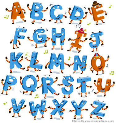 I've done way too many alphabet-related projects to really do a new piece for this topic. So I hope you enjoy some of these oldies but goodies. These were done for a little book for Educators Publishing Service.
 I also have a book out in the Fall called The Mixed-Up Alphabet written by Steve Metzger, illustrated by me. So thats plenty of alphabets already! But I thought about doing one as a quilting project-it might be pretty cool. If only I had some more time...
Subscribe to:
Comments (Atom)


